Did you know that by changing the colors on your home business branding and website, you can improve your conversions and sales?
Yeap! Color has the power to affect your customer’s perspective and emotions.
This means that choosing colors for your brand or website is not just a black-and-white decision.
Finding The Right Color for Your Home Business Website
You want your website to attract your audience and send a clear brand message, right? Well, some businesses go hand in hand with certain colors. For example, if you own a matchmaking service, you might use red or pink colors on the site.
For more color tricks, take a look at these popular colors and the psychological emotions they arouse in people:

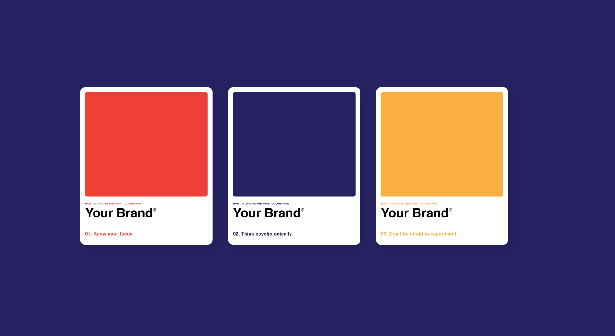
RED: Red colors are frequently associated with love, passion, romance, danger, excitement, action, and adventure. It’s also is a great color to use if you want to grab someone’s attention. Red is often used in the headline on a sales page. According to studies, red generated a higher conversion rate than other colors.

BLUE: Blue often embodies calmness. Frequently it is used to exhibit a professional image. Blue is linked with trustworthiness and success. It’s a symbol of water, purity, and cleanliness.

GREEN: Green represents money. It also personifies sustainable living, health, and nature. Green is another calming color that symbolizes life.

ORANGE: Orange typically portrays creativity, celebration, and fun.

PURPLE: Purple stands for passion. It’s also commonly used to signify royalty, luxury, and fantasy.

WHITE: White is clean. It is simple, and it is innocent.

YELLOW: Bright yellow isn’t customarily used on websites. It can provoke people to feel irritated or anxious. However, yellow can also represent playfulness and enjoyment. Many people associate pale yellow with youth.

PINK: Pink is a soft color. It’s also a very feminine color. It’s great for love, baby girls, women’s health and even young girls’ fashion and interests.

BROWN: Brown is an earthy color. It is simplicity, matter-of-fact attitudes, and essence.

BLACK: Often perceived to be dark and mysterious, black is also solid and stable. It’s a color that leaves no room for doubt or ambiguity.
So now what?
Ask yourself:
Do the colors on your website directly contribute to the model vision you want to depict?
Do they have the desired effect on your prospects and visitors?
If you’re unsure, contemplate making minor revisions, experimenting, and tracking results. Test the color of your headline. Test the color of your background. Test the color of your forms too.
Color has a powerful influence on emotions. It can motivate, inspire, and touch. Use these colorful touches on your site to improve your website’s look and to attract your ideal customers.


